In this article, we will delve into a comprehensive approach to analyzing the genetic diversity of potato using various statistical and multivariate analysis methods in R. The analysis encompasses techniques such as k-means clustering, hierarchical clustering, DBSCAN, and Principal Component Analysis (PCA), supported by clear visualizations to facilitate the interpretation of results. This guide aims to provide a robust framework for researchers and practitioners working in the field of plant genetics and diversity analysis.
Data Loading and Preparation
The first step in any analysis is to load and prepare the data. Here, we use R to read the data from an Excel file, select relevant columns, and scale the data. Scaling ensures that each variable contributes equally to the analysis, which is particularly important in clustering and PCA.
library(tidyverse)library(readxl)# Load the dataset from an Excel filedf <-read_excel("/Users/franklin/Documents/R/myblog/posts/conglomerados/DATOS_R_JUAN JOSE.xlsx")head(df)
# Column selection for the analysis (excluding TDS due to lack of variation)db <- df %>%select(2, 4, 15, 16, 19:21, 23:47)# Data preparation: remove non-numeric columns and scale the datasdf <- db %>%select(-2) %>%column_to_rownames("codigo_colecta")sdf <-scale(sdf)head(sdf)
K-means clustering is a partitioning method that divides data into a predetermined number of clusters, minimizing the within-cluster variance. The following steps include determining the optimal number of clusters and performing the clustering analysis.
Determining the Optimal Number of Clusters
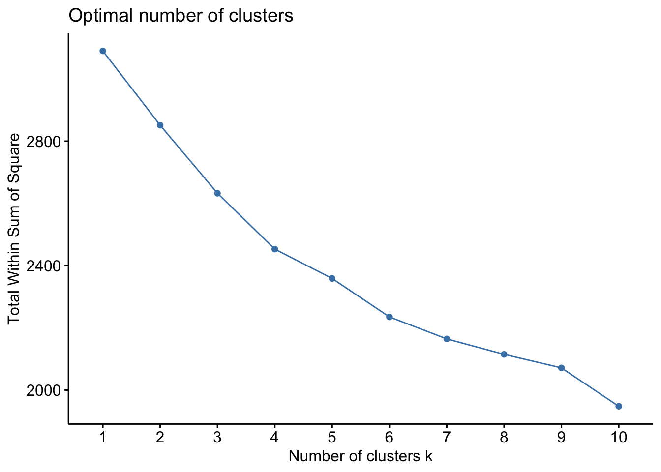
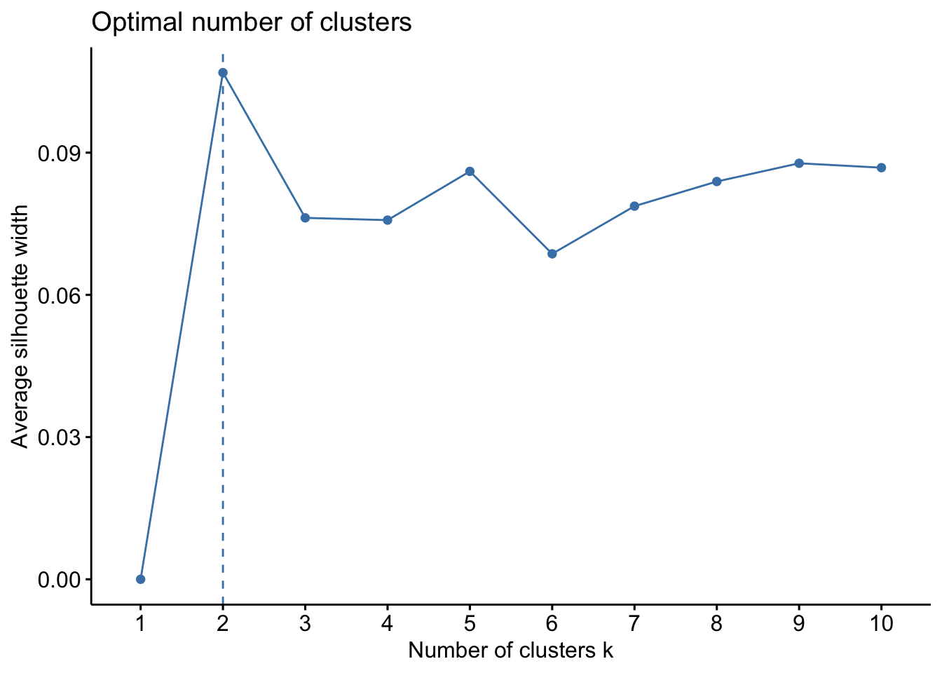
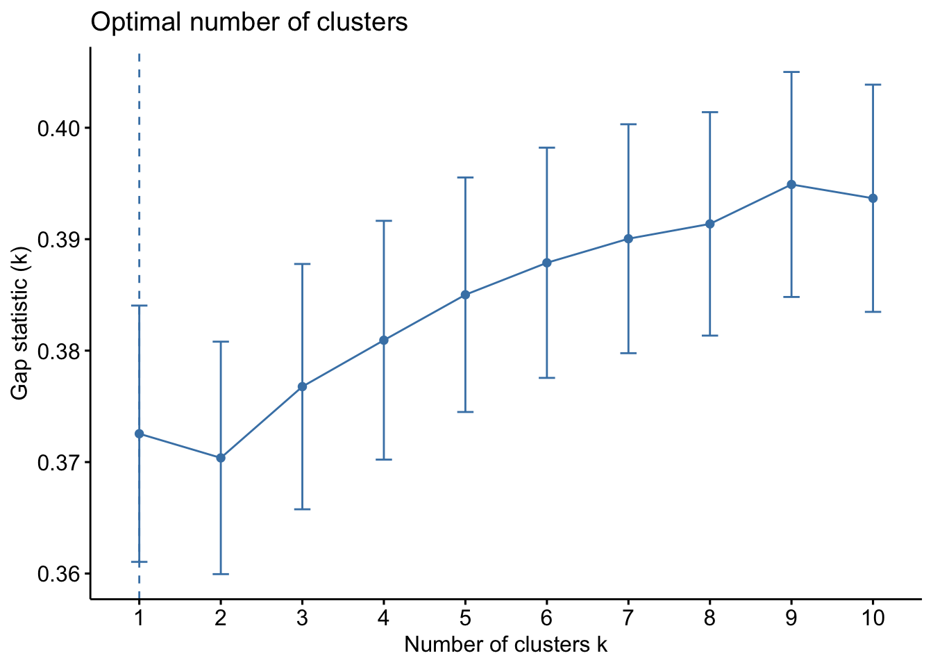
Determining the optimal number of clusters is crucial for meaningful clustering. We employ several methods, including the within-cluster sum of squares (WSS), silhouette analysis, and Gap Statistic to identify the most appropriate number of clusters for the dataset.
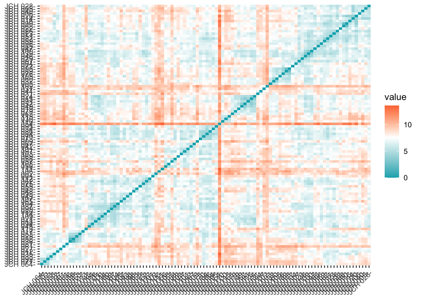
library(factoextra)# Compute distance matrix and visualizedistance <-get_dist(sdf)fviz_dist(distance, gradient =list(low ="#00AFBB", mid ="white", high ="#FC4E07"))
# Elbow method for WSSfviz_nbclust(sdf, kmeans, method ="wss")
The WSS method, often referred to as the “elbow method,” helps to identify the point where the marginal gain in explanatory power diminishes significantly, indicating the optimal number of clusters. The silhouette method provides a measure of how similar an object is to its own cluster compared to other clusters. The Gap Statistic compares the total within intra-cluster variation for different numbers of clusters with their expected values under null reference distribution of the data.
Applying the K-means Algorithm
After identifying the optimal number of clusters, we apply the k-means algorithm and visualize the clusters.
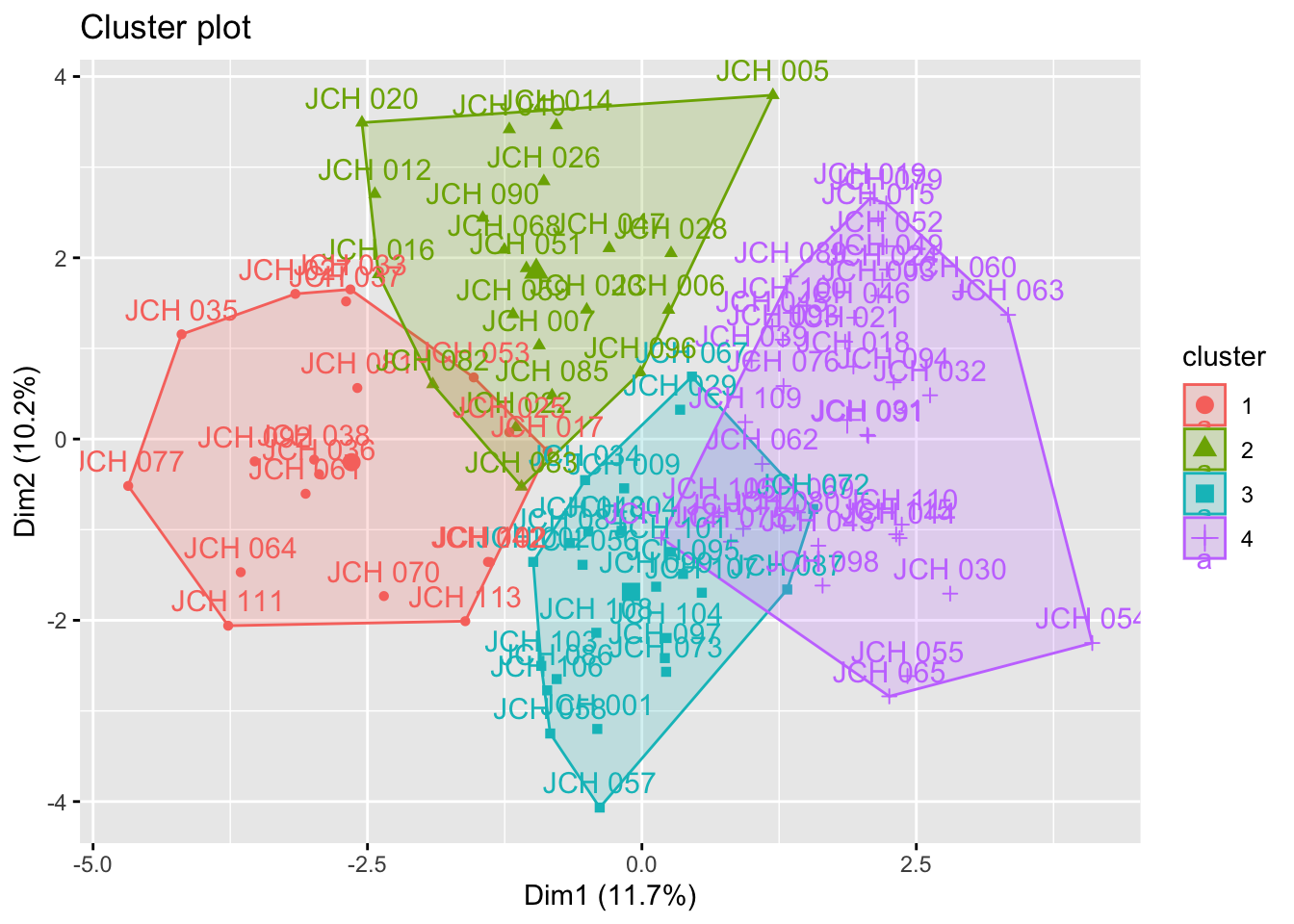
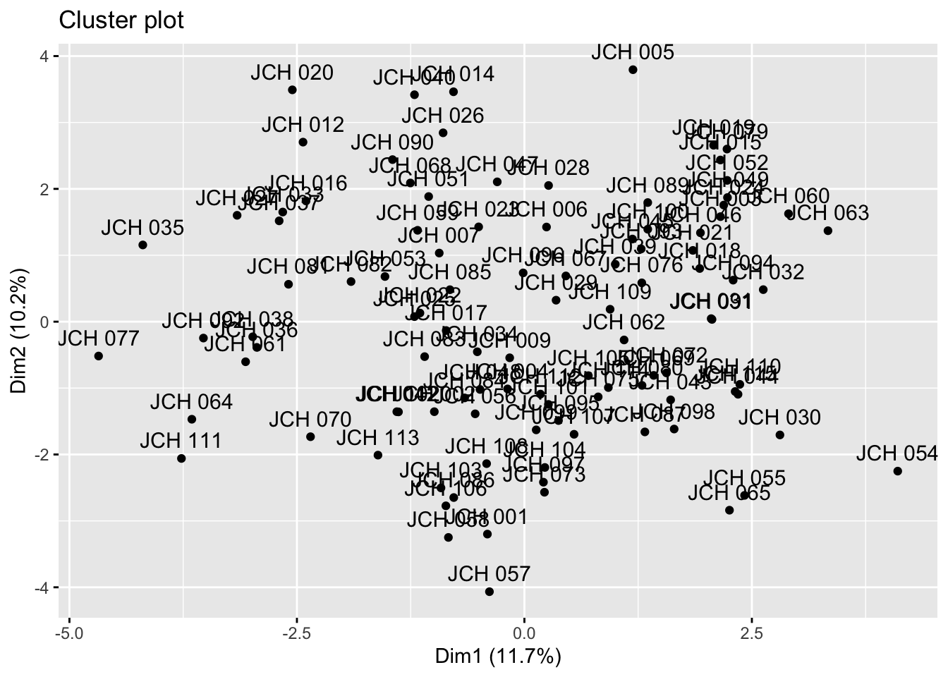
set.seed(123)kmeans_resultados <-kmeans(sdf, centers =4) # Replace 4 with the optimal number of clusters# Visualization of clustersfviz_cluster(kmeans_resultados, data = sdf)
The results from k-means clustering provide insight into how the samples are grouped based on their genetic characteristics. Each cluster represents a group of samples that share similar traits, and the visualizations help in understanding the distribution of these clusters within the dataset.
Hierarchical Clustering
Hierarchical clustering is another clustering technique that creates a hierarchy of clusters, which can be visualized as a tree or dendrogram. This method is particularly useful for visualizing the relationships between clusters and understanding the structure of the data.
Generating the Dendrogram
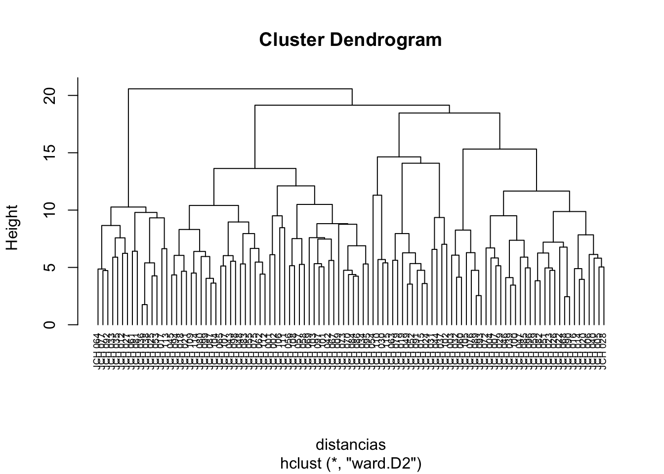
We begin by calculating the distance matrix using the Euclidean distance and applying the hierarchical clustering algorithm using Ward’s method, which minimizes the variance within clusters.
# Cut the dendrogram to form clustersgrupos <-cutree(res.hc, k =4) # Replace 4 with the desired number of clusters
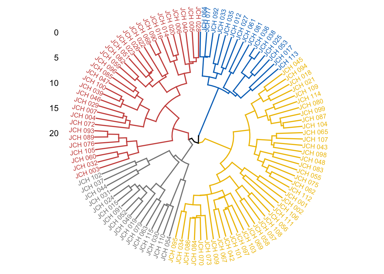
The dendrogram allows us to visualize how the clusters are formed and how individual data points or groups of points merge as the level of clustering increases. By cutting the dendrogram at a particular height, we can extract a specific number of clusters that represent the underlying structure of the data.
Assessment and Visualization
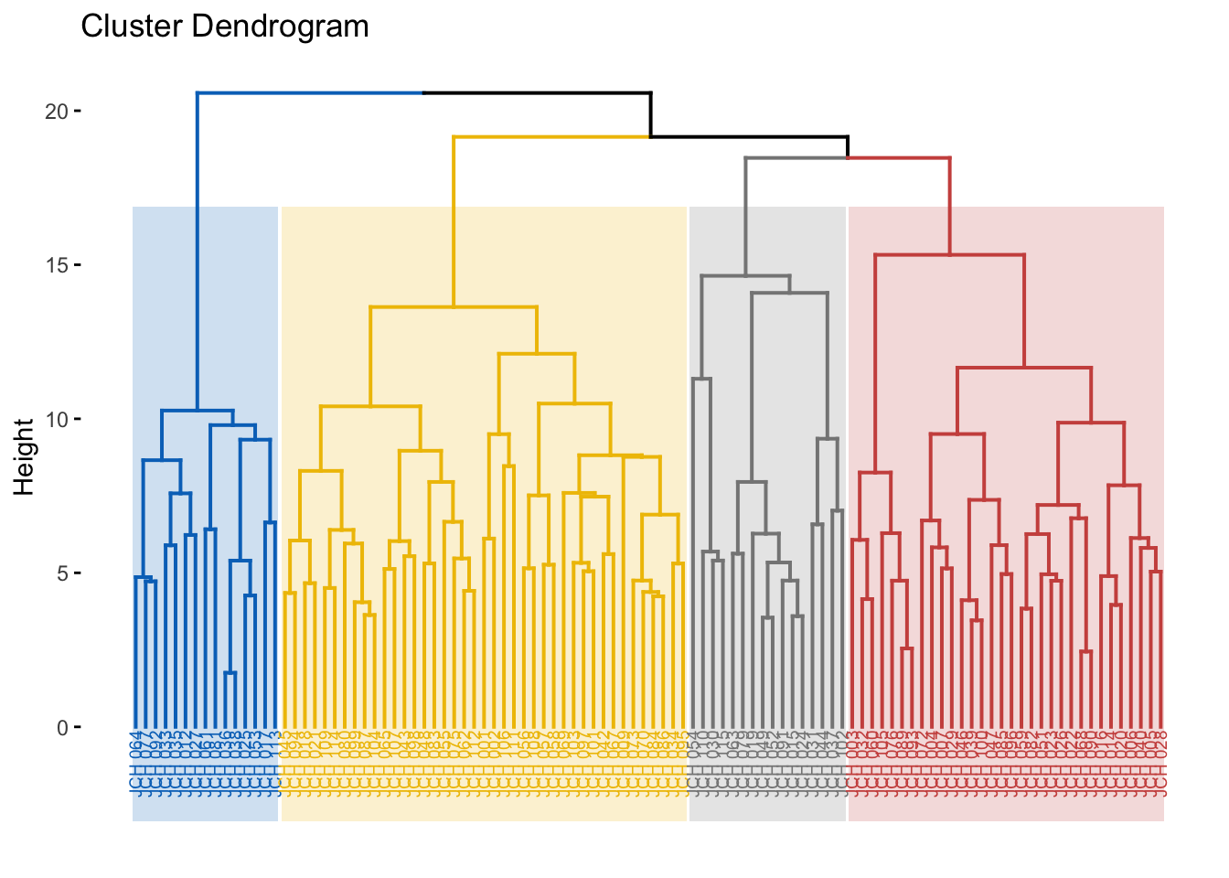
Different methods of hierarchical clustering can be compared to evaluate which method best captures the structure of the data. We then visualize the dendrogram with colored clusters for better interpretability.
# Comparison of different linkage methodsm <-c("average", "single", "complete", "ward")names(m) <-c("average", "single", "complete", "ward")ac <-function(x) {agnes(sdf, method = x)$ac}map_dbl(m, ac)
  average    single  complete      ward
0.5463403 0.4630005 0.6197599 0.7498075
# Visualize dendrogram with colored clustersfviz_dend(res.hc, cex =0.5, k =4, rect =TRUE, k_colors ="jco", rect_border ="jco", rect_fill =TRUE)
Warning: The `<scale>` argument of `guides()` cannot be `FALSE`. Use "none" instead as
of ggplot2 3.3.4.
ℹ The deprecated feature was likely used in the factoextra package.
  Please report the issue at <https://github.com/kassambara/factoextra/issues>.
Here, we assess different linkage methods such as average, single, complete, and Ward’s method. The agglomerative coefficient (AC) is computed for each method, with higher values indicating a better fit. The final dendrogram is color-coded to represent the different clusters, providing a clear visual summary of the hierarchical structure.
Density-Based Clustering: DBSCAN
DBSCAN (Density-Based Spatial Clustering of Applications with Noise) is a powerful clustering technique that identifies clusters based on density, allowing for the detection of outliers. Unlike k-means, DBSCAN does not require the number of clusters to be specified a priori, making it particularly useful for datasets with irregular cluster shapes.
Finding the Optimal Epsilon and Applying DBSCAN
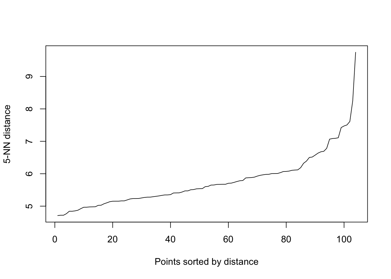
The epsilon parameter controls the neighborhood radius for density estimation. We begin by identifying an appropriate epsilon value through a k-NN distance plot.
library(dbscan)# Identify optimal epsilon using k-NN distance plotkNNdistplot(sdf, k =5)abline(h =0.5, col ="red") # Adjust according to the plot
The k-NN distance plot helps to identify a natural choice for epsilon by observing where the plot exhibits the most pronounced change in slope. The DBSCAN algorithm is then applied, and the results are visualized. Clusters are identified based on dense regions of points, with outliers being points that do not belong to any cluster.
Principal Component Analysis (PCA)
Principal Component Analysis (PCA) is a dimensionality reduction technique that transforms the data into a set of orthogonal components, explaining the maximum variance with the fewest components. PCA is especially useful for visualizing high-dimensional data in two or three dimensions.
Performing PCA and Visualizing Results
We perform PCA on the scaled data and visualize the results, focusing on the variance explained by each component and the relationship between variables and samples.
# Perform PCAacp_resultados <-prcomp(sdf, center =TRUE, scale. =TRUE)# Summary of PCA resultssummary(acp_resultados)
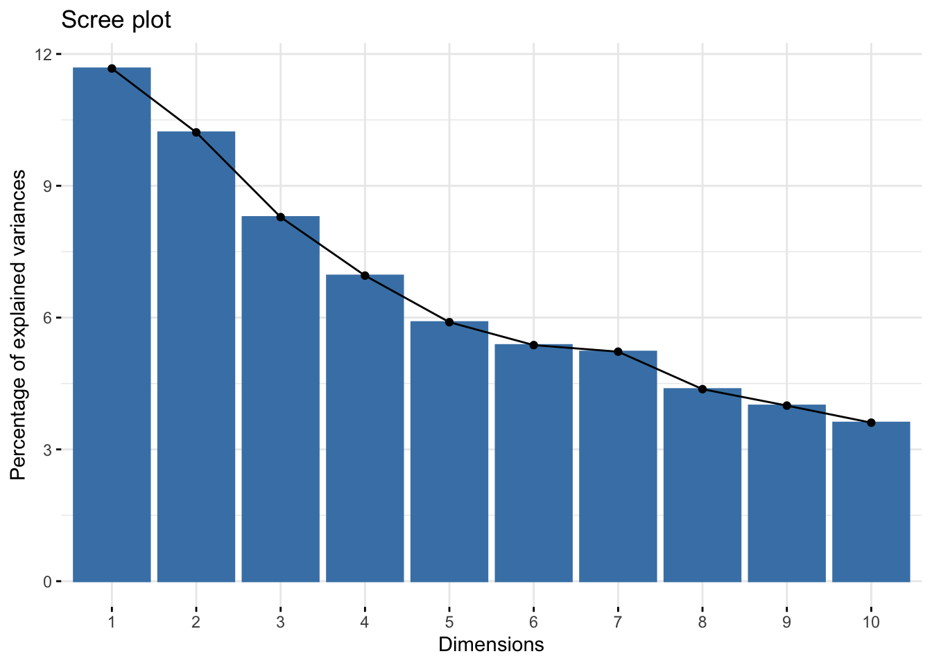
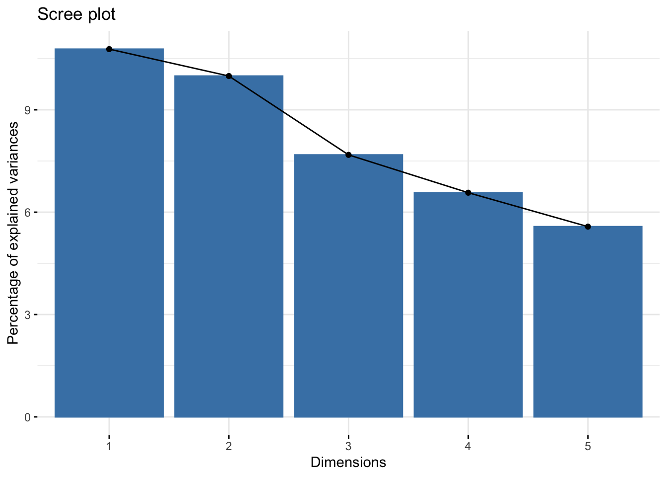
# Scree plot showing explained variance by each componentfviz_eig(acp_resultados)
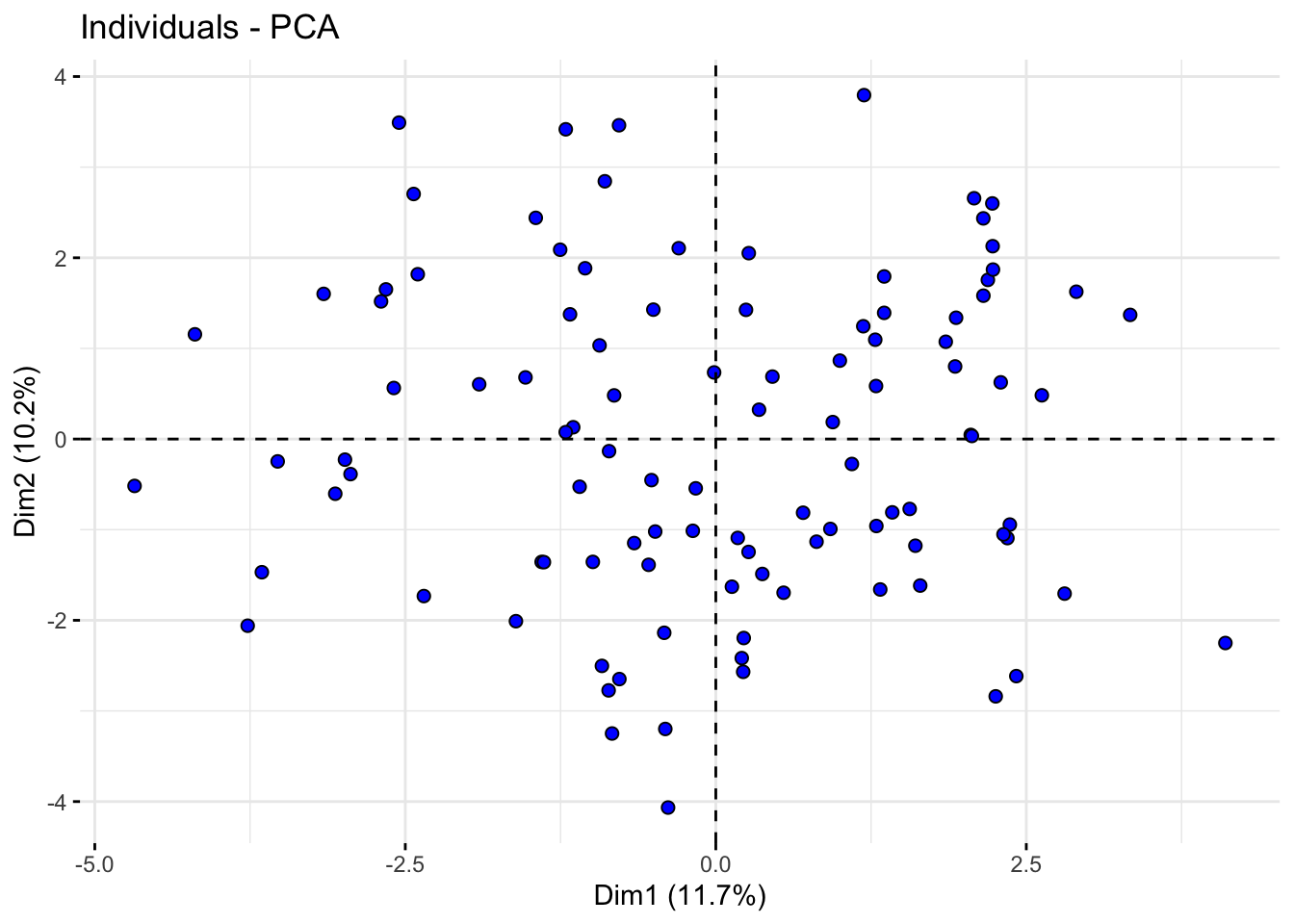
# Plot of individuals in the space of the first two principal componentsfviz_pca_ind(acp_resultados, geom.ind ="point", pointshape =21, pointsize =2, fill.ind ="blue", col.ind ="black", repel =TRUE)
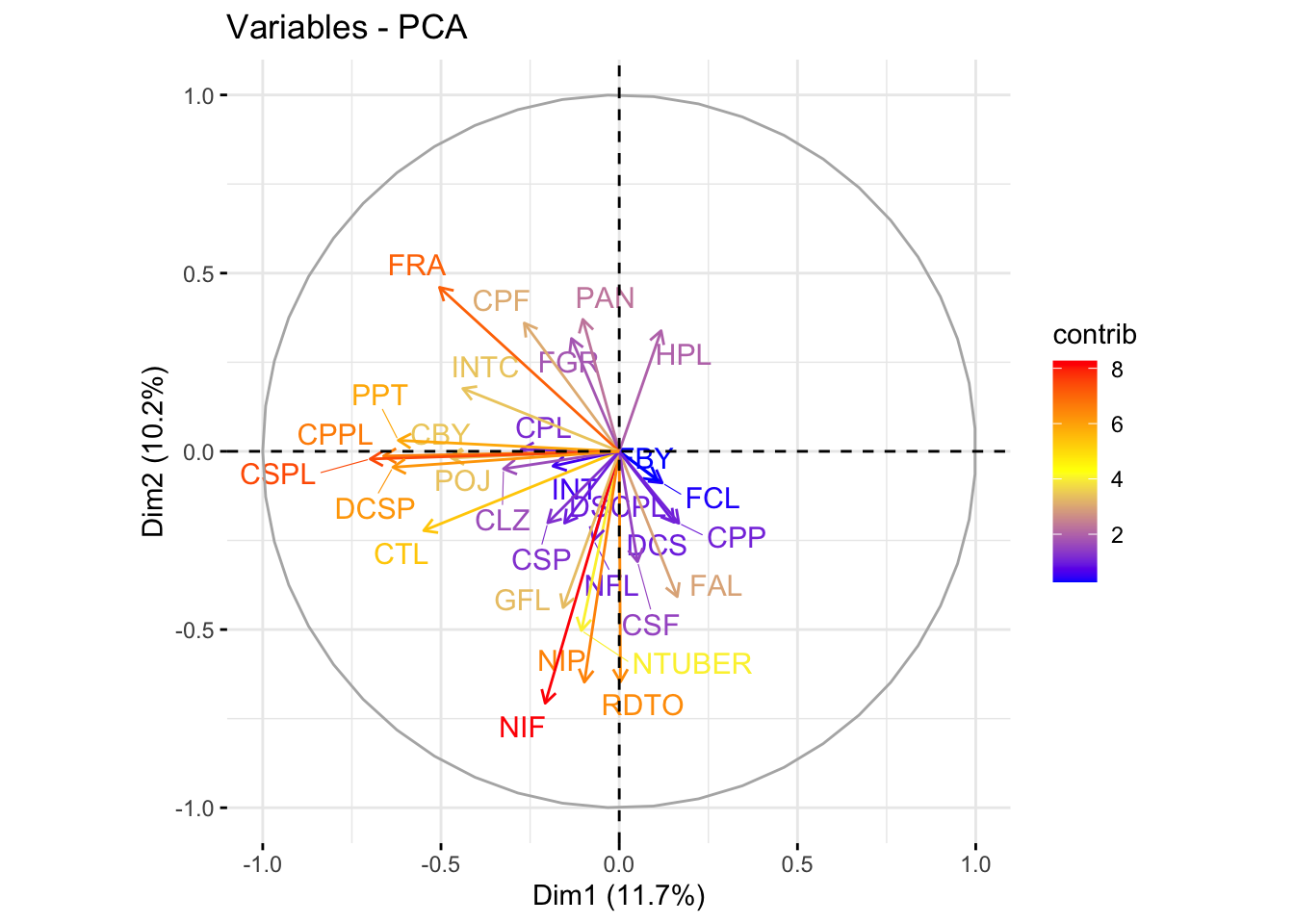
# Plot of variables in the space of the first two principal componentsfviz_pca_var(acp_resultados, col.var ="contrib", gradient.cols =c("blue", "yellow", "red"), repel =TRUE)
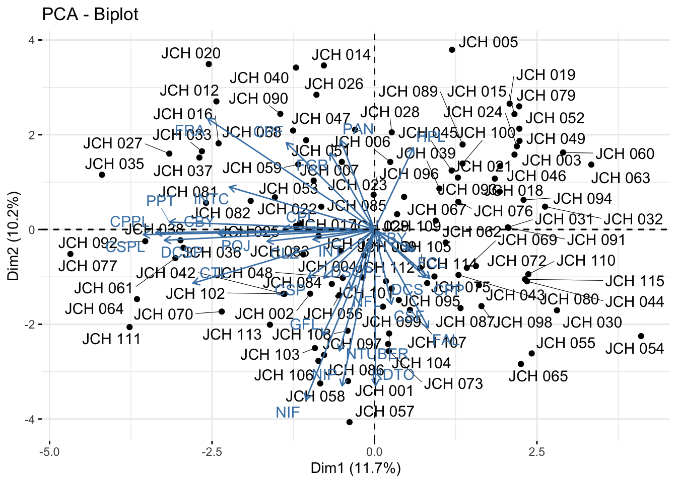
# Biplot showing both individuals and variablesfviz_pca_biplot(acp_resultados, repel =TRUE)
The scree plot shows the proportion of variance explained by each principal component, aiding in the selection of the number of components to retain. The PCA biplots allow us to interpret the contribution of variables to the principal components and observe the distribution of samples along these components. This visualization is key to understanding the underlying structure of the data and the relationships between different genetic traits.
Multiple Factor Analysis (MFA)
For datasets containing both quantitative and qualitative variables, Multiple Factor Analysis (MFA) is applied. MFA is an extension of PCA that can handle mixed data types and is particularly useful in genetics studies where both types of data are often present.
Performing MFA and Interpreting Results
We perform MFA on the mixed dataset and visualize the results, focusing on the contributions of quantitative variables and the distribution of individuals across groups.
# Convert character variables to factorsdf2 <- db %>%column_to_rownames("codigo_colecta") %>%mutate_if(is.character, as.factor)library(FactoMineR)# Perform MFAres.famd <-FAMD(df2, graph = F)print(res.famd)
*The results are available in the following objects:

  name          description
1 "$eig"        "eigenvalues and inertia"
2 "$var"        "Results for the variables"
3 "$ind"        "results for the individuals"
4 "$quali.var"  "Results for the qualitative variables"
5 "$quanti.var" "Results for the quantitative variables"
# Scree plot showing the percentage of variance explained by each componentfviz_screeplot(res.famd)
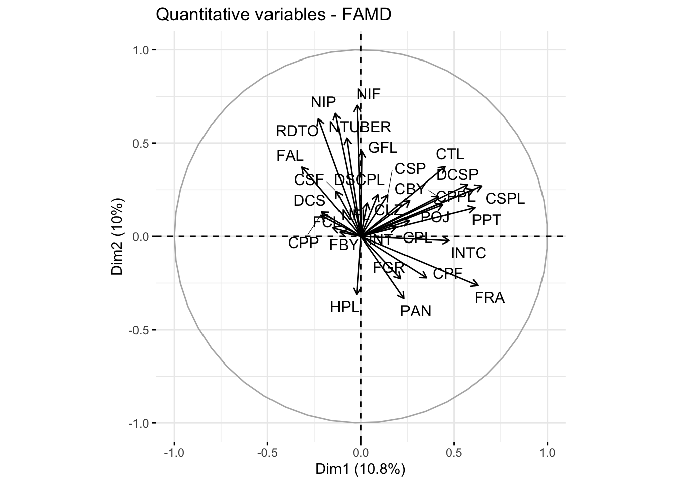
# Plot showing the contribution of quantitative variablesquanti.var <-get_famd_var(res.famd, "quanti.var")fviz_famd_var(res.famd, "quanti.var", repel =TRUE, col.var ="black")
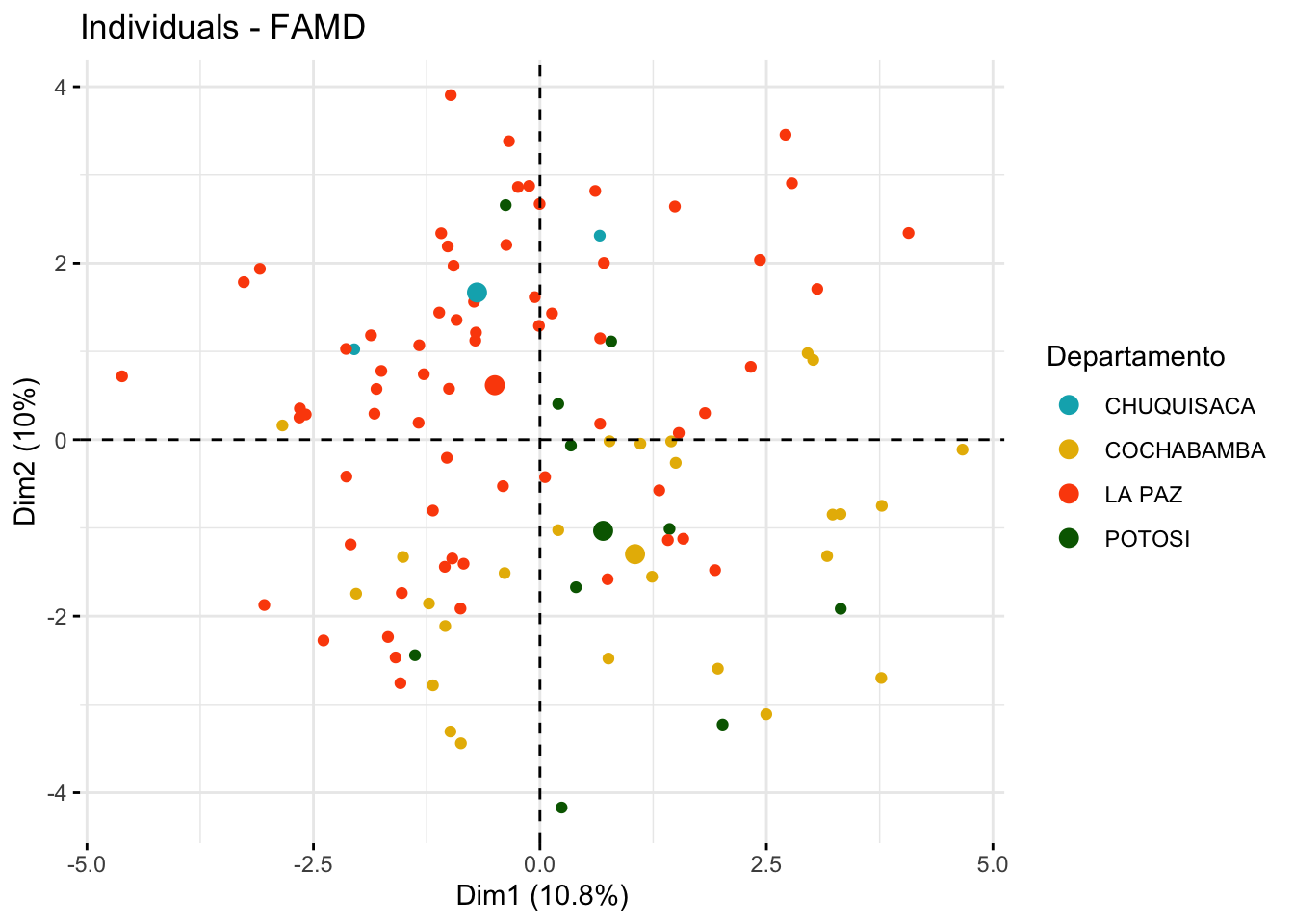
# Visualization of individuals by group with confidence ellipsesfviz_mfa_ind(res.famd, habillage ="Departamento",palette =c("#00AFBB", "#E7B800", "#FC4E07", "darkgreen"),addEllipses = F, ellipse.type ="confidence", repel =TRUE,label ="none" )
The MFA analysis allows us to decompose the data into factors that explain the most variation, considering both types of variables. The scree plot helps determine how many factors to retain, while the visualizations provide insights into the contributions of individual variables and the grouping of samples based on both qualitative and quantitative characteristics.
Conclusion
This workflow provides a comprehensive and detailed framework for conducting genetic diversity analysis in potato using various clustering and multivariate analysis techniques in R. By employing different methods, researchers can gain a deeper understanding of the genetic structure within their dataset, identify meaningful patterns of variation, and ultimately make informed decisions in breeding programs and conservation efforts. The choice of method depends on the specific nature of the data and the research objectives, whether it is to identify distinct genetic clusters, reduce data dimensionality, or both.